remodeling our stairs part 1 - the research
Which design decisions are you tackling? Home takes time. We can help you refine your vision and have you cozying up in your space sooner than you think. Book a virtual consult today and let’s get started.
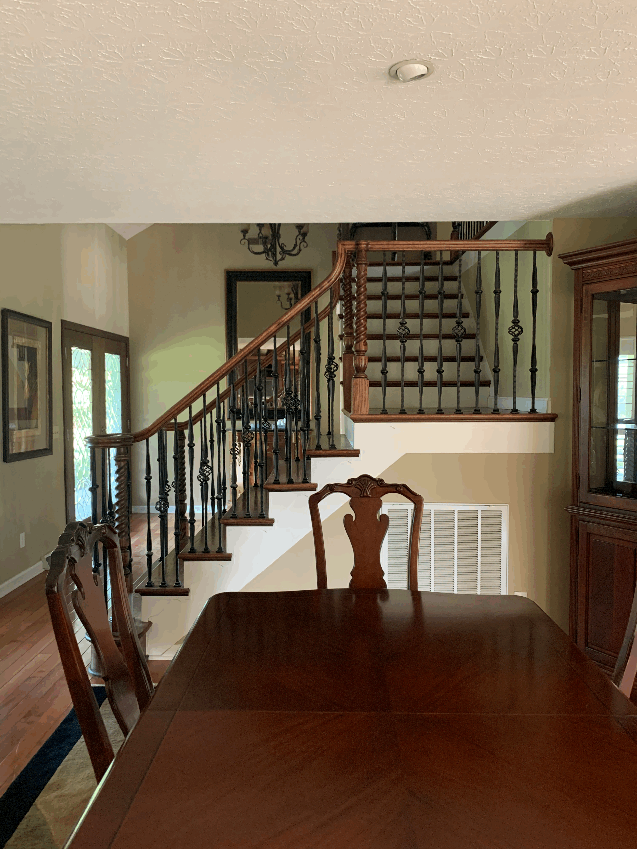
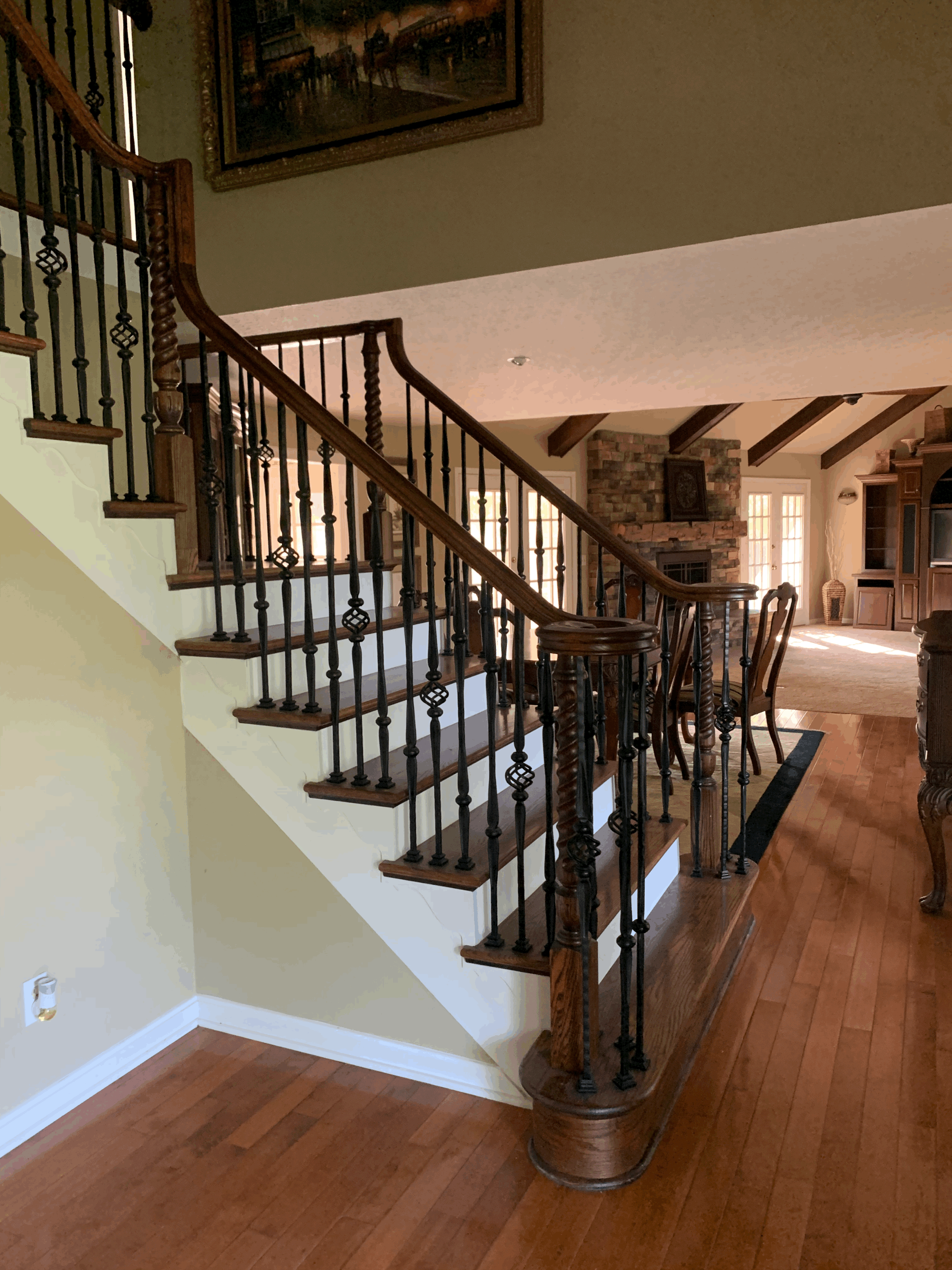
Since purchasing our home last fall, we knew one of the first things we wanted to tackle is the stairs. The dark basket style iron balusters, and red oak treads, handrail and posts are just a little too formal for me. Our goal is to lighten up and comfy up this house and if we want that vibe, the stairs have to go.
A few shots I took of the stairs when we first toured the home. The stairs are the first thing you see when you walk in our front door. I want them to be clean, fresh, classic, welcoming and represent our taste in home design and how we nest. I spent months researching and collecting Inspo for how I want these stairs to transform. I got myself into a real mess because there are so many beautiful options that I love and if there is a rabbit hole to go down, I WILL go down it. I asked all of you on instagram to help me. I polled and messaged back and forth with you on which was your favorite but I still had such a hard time pulling the trigger.
Do I want to stick with the over the post handrail look but tapered wood balusters in a rich black paint like Eyeswoon’s beautiful NYC apartment? We are planning on herringbone floors in the foyer, in fact they have been acclimating in our house for six months. They will be very well acclimated when we’re ready to install;)
Another vote for black tapered balusters with over the post handrail in black in Chris Loves Julia’s home they just moved out of.
Next I moved on to a little of both black (iron in this case) and natural white oak (our floors will be natural white oak). This beauty by Hammer Kraft always makes me gasp.
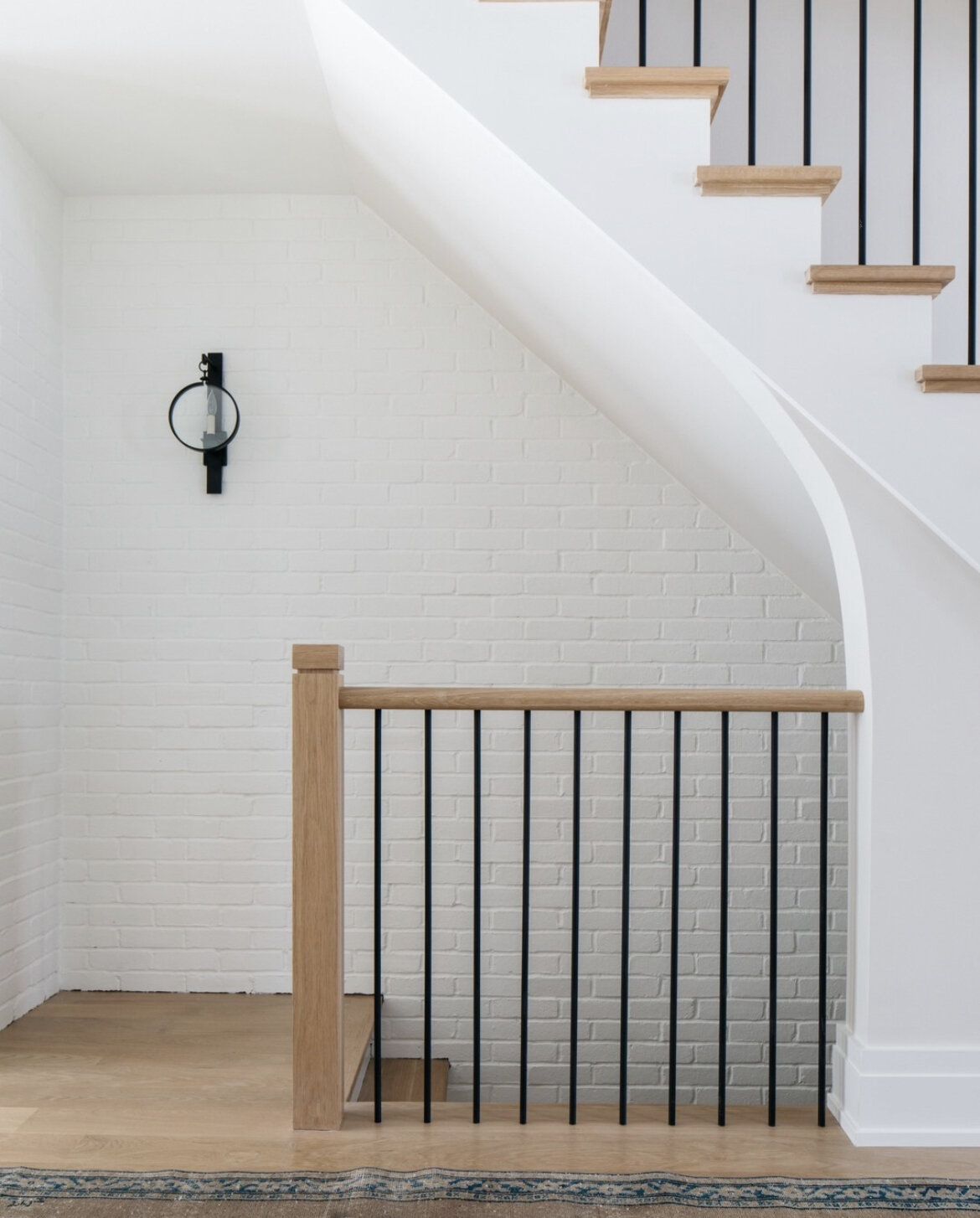
Another look at mixing black (iron) and natural white oak over the post handrail by Paul Bates Architects.
And another by Kate Marker Interiors but this time with a post to post look of natural white oak handrail, natural white oak posts and black iron balusters.
Next, I started looking around our property to see what I loved that I didn’t want to change. One of the things is our black iron fence around the pool. I love the spheres on the top of the posts.
So I naturally went down another rabbit hole of looking for spheres. I searched high and low and didn’t find many but the ones I did find, I love. I don’t want white posts but I can envision this with black posts. Another beauty by Kate Marker Interiors and Grand Tradition Homes.
I spy a black wooden post with a sphere, just what I’ve been looking for. And I could get used to the rest of this situation real fast too. The arched door, the stone, the wide plank hardwood floors , all by Marie Flannigan Interiors is just gorgeous.
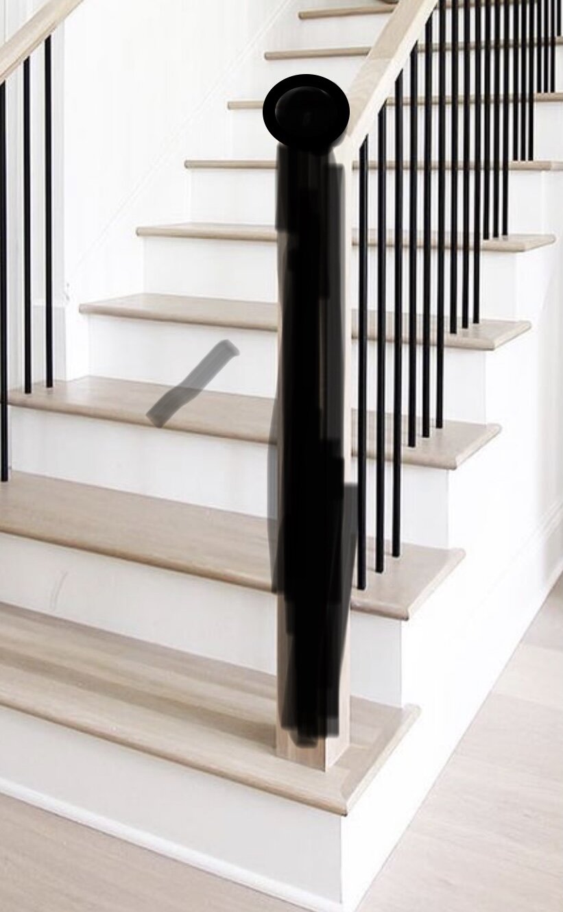
So then I started marking up existing photos to add a sphere to the top of all of the newel posts in black.
This was a beautiful scene by M House Development before I butchered it but I just need to see what I have in my head.
And then I marked up this one by Kate Marker Interiors and it’s the closest thing I can find to what I’m going for so far. After spending so much time trying to find exactly the look we’re going for and would best fit in our design plan, I had some 3D drawings made so I get a little better idea of the options I had narrowed it down to. I plan to show those in my next blog post. Until then, I’ll just be over here continuing to confuse myself with all the beautiful stair options.


